Help Centre
<
HomeUpdating the positioning of Search
Industry best practice suggests displaying your Salesfire Search below your website header to fit seamlessly with your site layout.
To update the positioning of your Search click the Edit Search button and select Positioning.
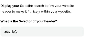
To complete this, retrieve the selector of your header and paste it into the What is the Selector of your header field.
To find the required selector:
- Hover over the header element on your site and right-click.
- This brings you to the right click menu, choose the Inspect option to inspect the element on your site of where you would like the Search to be placed.
- The class name will appear in the image section when highlighted after inspecting the element and also displayed within the HTML.
- One example of how this may look is it may reveal a class such as nav--left
Just add a full stop to the front of the class to allow the search position to be placed in the required selector, further examples below of how the class may be extracted from your site.
Example:
.nav--left

Any class that has spaces in it like your nav selector would need to be joined together with full stops.
Example:
navbar navbar-default navbar-static-top becomes this: .navbar.navbar-default.navbar-static-top
Once you have located this and added the full stop, place in the Input Selector field. Follow the same steps for a mobile variant if your site has a separate mobile layout, select save to update your changes.
Offset threshold
This is the maximum offset we will display your Search at before defaulting to fullscreen. This is to prevent your search box from displaying too far down on mobile and also to offset the search beneath your category sections on desktop.
If you require further information on finding the header selector, please contact support@salesfire.co.uk.
You can use the percentage field to enter the threshold you would like to offset the search display by.
Upon adjusting the percentage you will see a preview of how this will be presented on your live site.
Max width
In this field you can provide a percentage for the maximum width of the search container.
This will ensure the search fits to a maximum display on larger desktop devices.