
Help Centre
<
HomeThe Performance Overview section in your Salesfire dashboard provides a detailed snapshot of key metrics to your business. The data can be viewed using the data comparison picker to compare performance over significant periods to your business.
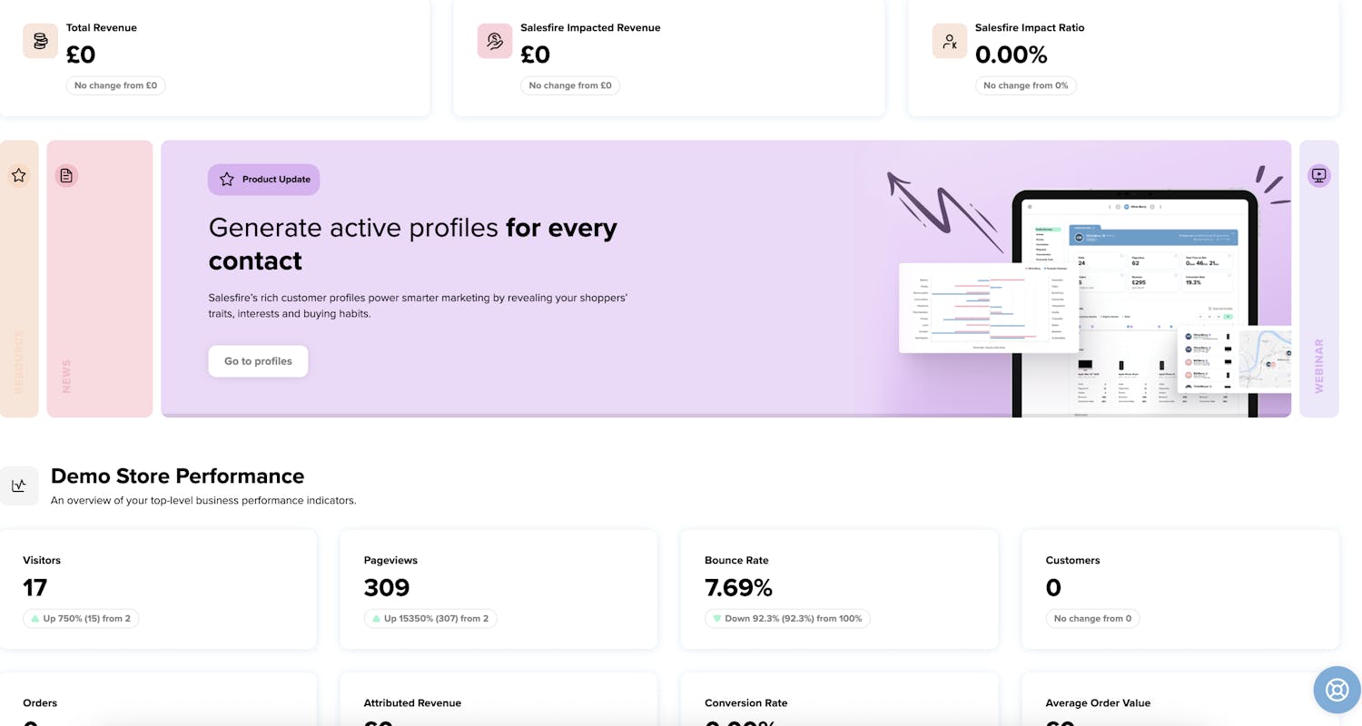
Total Revenue
The total revenue figure shown throughout the dashboard is approximately 14% lower than that of Google Analytics. The metric produced by Salesfire does not include revenue from tax or shipping. You can find out more on how Salesfire analytics work alongside Google Analytics.
Salesfire Impacted Revenue
Salesfire Impacted Revenue represents the total value of orders influenced by any product within the Salesfire suite. This metric captures the revenue from purchases where a customer engaged with a Salesfire tool at some point in their journey prior to completing the order. It reflects the contribution Salesfire has made in guiding the customer toward conversion.
Salesfire Impact Ratio
The Salesfire Impact Ratio indicates the proportion of total revenue that has been influenced by Salesfire tools. It shows what percentage of your overall sales involved at least one interaction with a Salesfire product during the customer journey.
Company Overview
In your company overview section you will be presented with your top level business performance indicators.
Visitors
The total number of individual users who visited the website during the selected period. Including a comparison from the previous period you have selected.
Pageviews
The total number of pages viewed by visitors. Including a comparison from the previous period you have selected.
Bounce Rate
The percentage of visitors who left the site after viewing only one page. Including a comparison from the previous period you have selected. .
Customers
The number of unique customers who made a purchase. Including a comparison from the previous period you have selected.
Orders
The total number of orders placed. Including a comparison from the previous period you have selected.
Attributed Revenue
The amount of revenue directly linked to interacting with a product in the Salesfire suite where a purchase has occurred. Including a comparison from the previous period you have selected.
Conversion Rate
The percentage of visitors who completed a purchase. Including a comparison from the previous period you have selected.
Average Order Value
The average amount spent per order. Including a comparison from the previous period you have selected.
Core Metric Overview
You may also use the Core Metric Overview graph to filter views, orders, revenue etc over the data range selected.
Live On Site visitors
View the visitors live on your website and the pages they are visiting across their chosen device.
Latest Orders
View a quick snapshot of the latest orders logged from your website. Full orders can also be found in the order section of your dashboard by clicking on the View all button.
Customers Overview
The Customers section within your Performance Overview will indicate what a typical customer profile looks like.
Customers
This shows the total number of unique customers within the selected time period. It represents how many individuals have made at least one purchase. The change indicator (e.g., “Up 41%”) shows how this total compares to the previous period.
Average LTV (Lifetime Value)
Lifetime Value is the average amount of revenue a customer is expected to generate over the entire duration of their relationship with the business. This metric helps estimate long term profitability per customer. A decrease indicates customers, on average, are spending slightly less over time.
Avg Time to Buy
This measures how long it typically takes a customer to make their first purchase from the moment they begin interacting with your site (e.g., first visit). A longer time may indicate slower decision making or friction in the buying experience.
Avg Visits to Buy
This shows the average number of sessions or visits a customer makes before completing their first purchase. A higher number may suggest customers need more touchpoints before deciding to buy.
Revenue per customer
Total sales (including taxes minus any discounts or refunds) per customer in that cohort so far.
Cohorts (First Order At)
Customers are grouped based on the month they made their first purchase. For example, “Nov 2025” shows all customers whose first ever purchase occurred in that month. This allows tracking of behaviour over time.
New Customers
This shows how many new customers were acquired in each cohort month.
R% (Retention Percentage)
It tracks customers who return in a subsequent month. If a customer buys twice in their first month (e.g., Nov 1st and Nov 15th), they are not counted as "returning" in this specific metric.
Revenue Grid
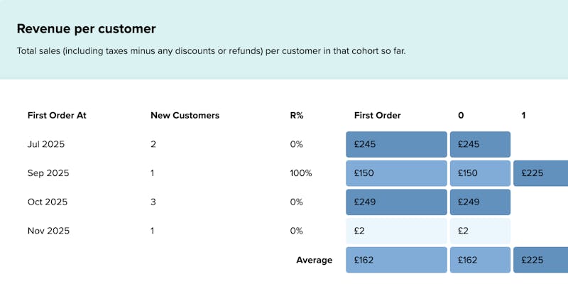
The values represent the Lifetime Average Order Value:
Example of Grid Values:
- Month 0: Customer spends £10. Grid shows £10.
- Month 1: Customer returns and spends another £5.
- Grid for Month 1 shows: £15 (The initial £10 + the new £5).
The grid shows the growing total value of the customer over time, rather than isolated monthly spending.
Retention
The retention analytics in your Salesfire dashboard will give insights into brand loyalty.
Active Customers
Active Customers represent the number of distinct customers who placed at least one order during the selected time period.
This metric helps you understand how many unique shoppers were engaged and making purchases in that timeframe.
Calculation:
Active Customers - Count of unique customers with at least one order in the selected period.
Churned Customers
Churned Customers are those who ordered in the previous period but didn’t order in the current period. This indicates how many previously active customers did not return.
Calculation:
Churned Customers - Unique customers who ordered in the previous period but not in the current period.
Churn Rate
Churn Rate shows the percentage of customers who were active in the previous period but did not return to place an order in the current period.
This metric highlights how many customers you are losing month-over-month or period-over-period.
Calculation:
Churn Rate - (Churned Customers / Active Customers from Previous Period) × 100.
Returning Customer Rate
Returning Customer Rate represents the percentage of customers from the previous period who came back and placed an order in the current period.
It is the opposite of Churn Rate and highlights customer loyalty and repeat behaviour.
Calculation:
Returning Customer Rate = 100 − Churn Rate.